
Data Visualization for Biologists: How to Choose the Right Chart Type
Data visualization is essential in biological sciences, enabling researchers to explore and interpret complex biological data effectively. By summarizing large datasets into graphical formats, visualizations reveal patterns, trends and anomalies that are often hidden in raw data. This helps improve the understanding of biological processes, as well as effectively communicate information across different research teams.
With a variety of chart types available, each suited to different purposes, selecting the right visualization is crucial for meaningful analysis and communication. Factors like data type, visualization objectives and intended audience play a key role in determining the most effective chart. The right choice can enhance clarity and glimpse insights, while an incorrect chart type can obscure important information.
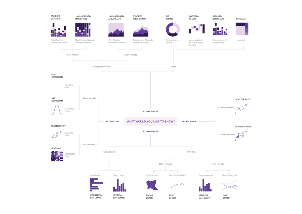
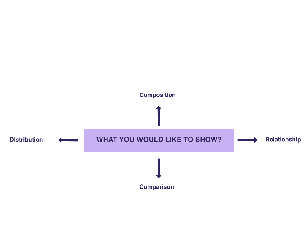
Let’s take a look at some common types of charts used to represent biological data. You can start by asking the question: Are you interested in composition, relationship, comparison or distribution of data within your samples? Then, decide which specific type of chart best fits the purpose.
Composition: Showing part-to-whole relationships
Understanding how components contribute to a whole, such as analyzing the composition of cell types in a tissue sample, is essential in biological data analysis. These charts highlight the part-to-whole decomposition clearly:
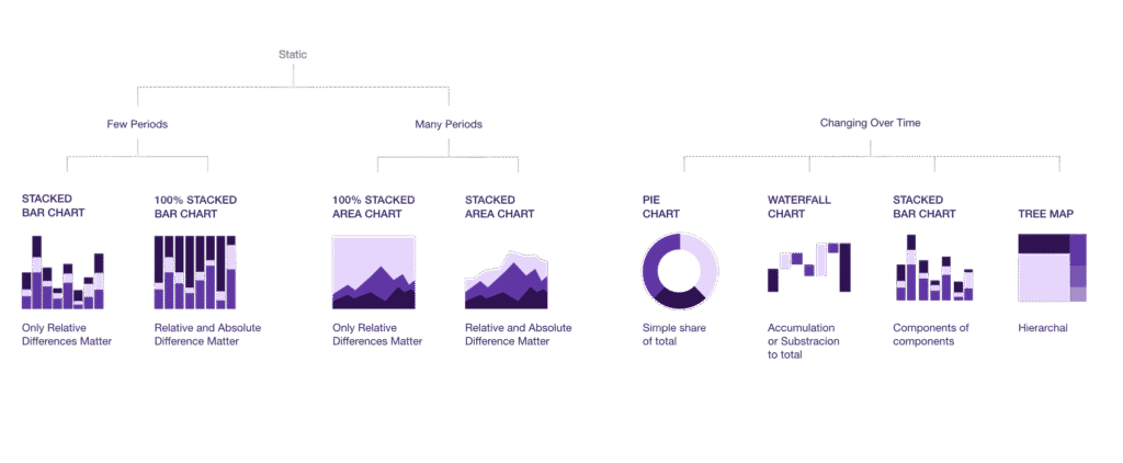
Static data:
- Pie or donut charts: Represent a simple share of the total, such as the percentage of the population with a given genetic variant. However, pie or donut charts are sometimes criticized because our visual system is much better at comparing lengths along a straight line (like in bar charts) than comparing angles or areas. Other types of charts—such as lollipop of bar charts—may be better at representing composition.
- Tree map: Tree maps can be used to represent the same information as the pie chart, but are easier to read. For example, tree maps are used in Gene Set Enrichment Analysis (GSEA), used to determine the contribution of specific biological pathways to a process or whether a set of genes is enriched/depleted in a dataset of gene expression changes.
- Waterfall chart: Visualizes cumulative effects of sequentially introduced values. They can be used to illustrate how various metabolic pathway components contribute to an overall flux or how gene knockouts sequentially affect gene expression totals.
Composition across samples:
- Stacked bar chart: Used for comparing part-to-whole relationships across groups, such as the numbers of different cell types across treatments in single-cell RNA-seq data (cell composition analysis).
- 100% stacked bar chart: Normalizes each category to the same total (100%), making them useful when the focus is on relative proportions, such as comparing the shifting ratios of bacterial phyla in the gut microbiome across dietary interventions.
Change over time:
- Stacked area chart: Facilitates representation of data with many time points, such as continuous monitoring of vitals over time through fitness trackers.
100% stacked are chart: In contrast to the example above, these charts are used for data where only relative differences are important (not absolute values).
Relationship: Observing variable interactions
Biological systems are complex and often require understanding interactions—between genes, proteins and/or environmental factors. You can use these types of charts for exploiting relationships:
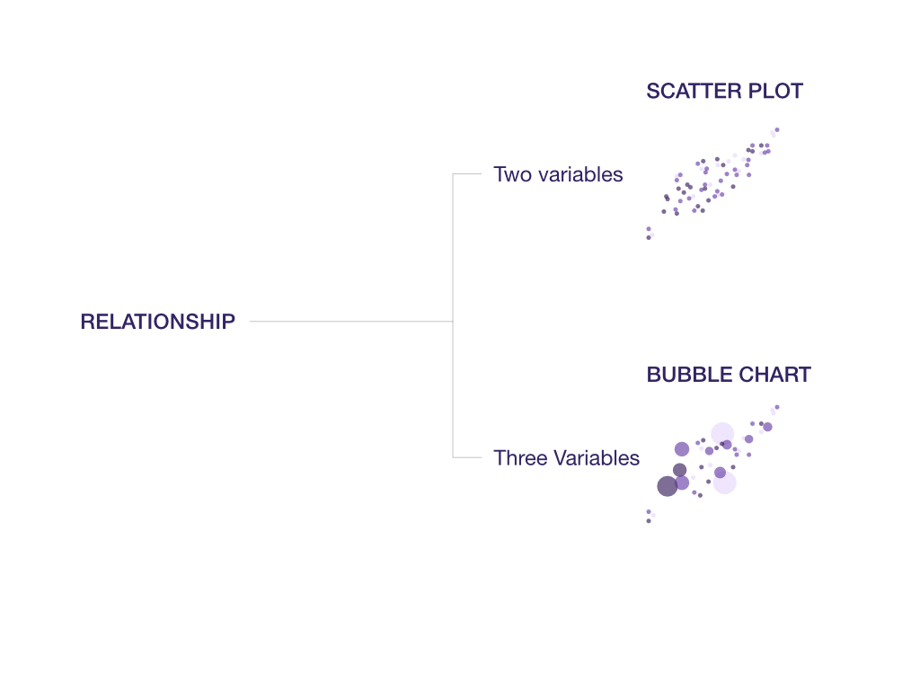
- Scatter plots: Used for visualizing correlations, such as plotting gene expression levels between two experimental conditions.
- Bubble charts: An extension of scatter plots that includes a third variable—like showing gene expression by plotting two factors and using bubble size to reflect expression intensity.
Comparison: Comparing group values
Comparing biological groups is central to many studies, such as comparing healthy and diseased tissue or treatment vs. control. It is important to represent this information in a clear and objective way in order to draw meaningful conclusions, which can be accomplished with the following chart types:
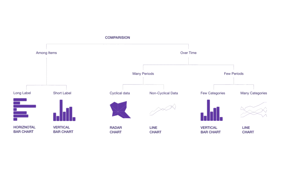
Comparison among items:
- Horizontal or vertical bar charts: Used for ranking or comparing categories, like concentrations of metabolites across samples. The horizontal bar charts work better for data with long labels, such as genes in biological pathways, while the vertical could be used, for example, to show the number of samples with a specific level of antimicrobial resistance (MIC concentration).
Comparison over time:
- Line chart: Showing continuous trends across time points, like monitoring patient biomarkers throughout treatment.
- Radar chart: Used for cyclical or periodic data, such as circadian gene expression levels over 24 hours.
- Vertical bar chart: Effective for fewer time points or categorical comparisons, such as before and after treatment comparisons of biomarker levels.
- Line charts with multiple lines: Comparing trends across several categories simultaneously, such as time-series gene expression for multiple genes.
Distribution: Visualizing data spread
Understanding the distribution of biological data can reveal important patterns. For example, it can help you identify whether the data is normally distributed, skewed or multimodal, and can reveal meaningful patterns like variability in response or rare events:
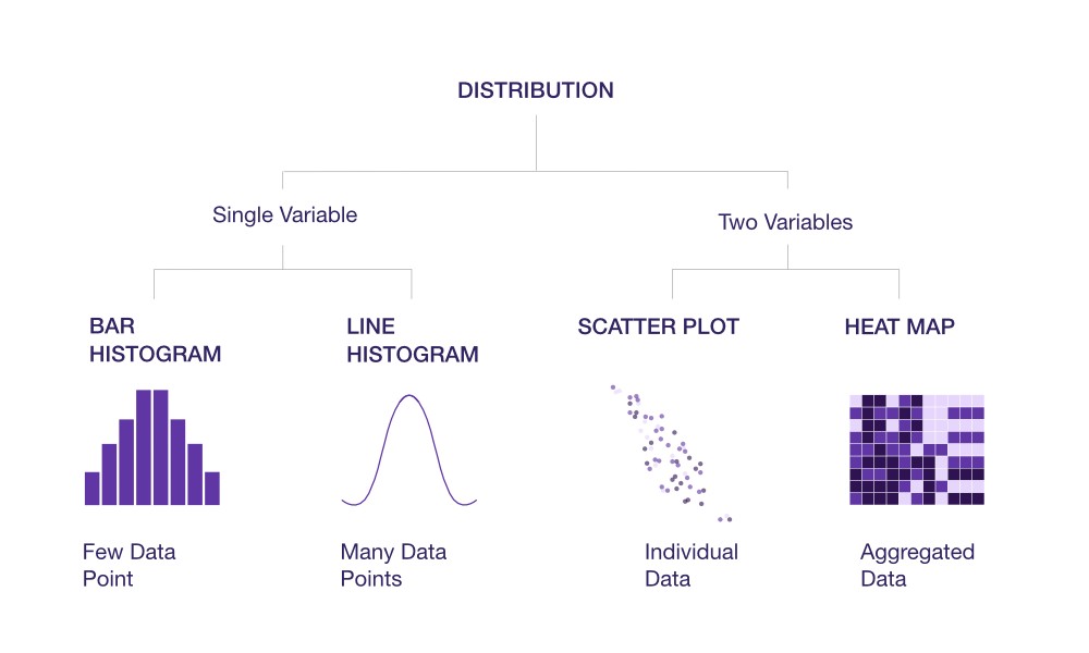
Single variable:
- Bar histogram: Histograms are a universal type of chart used to represent data distribution. They can be used to check the distribution of non-adjusted p-values in differential expression data, the distribution of concentration values of a metabolite or protein across samples, and other types of biological distributions.
- Line histogram or density plot: Smoothed representation of quantitative data, like the distribution of transcript lengths or protein abundances.
Two variables:
Scatter plot: Useful for visualizing joint distributions or identifying clusters, outliers and trends. Scatter plots are one of the most common and effective ways to visualize PCA (Principal Component Analysis) results. Color, shape or size can be added to points to represent categories, groups, or continuous variables (e.g., experimental conditions, cell types or treatment groups).
Heat map: Commonly used in genomics and transcriptomics to visualize gene expression data or mutation frequencies across samples or conditions.
Extract powerful insights from biological data with the right visualization tools
Effective biological data visualization is indispensable for interpreting and communicating complex data with clarity.
By leveraging a variety of visualization tools and techniques, such as colors, sizes and interactive features, scientists can uncover patterns, trends and relationships within large-scale biological datasets. These advancements enhance our understanding of biological systems, facilitate hypothesis generation and accelerate innovation in drug discovery and development.
If you are looking for help with data visualization, you can download our data visualization guide. And, of course, feel free to reach out to one of Ardigen’s specialists for expert advice on the statistical analysis, data visualization and extracting insights from your biological datasets.